
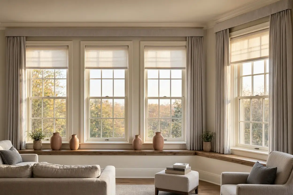
Rooms with several windows can be full of light and architectural interest, but they can also feel visually unsettled when each opening is treated as a separate design problem.
One window may be tall and narrow, another wide and low. A bay may sit beside a standard window, or a glazed door may share the room with smaller openings. Trying to make every treatment identical can look forced, while allowing each window to develop its own colour, material and visual weight can make the room feel fragmented.
The better approach is to create a sense of rhythm. Repeated colour, proportion, alignment and material can connect different windows without pretending they are the same.
Begin with the room, not the individual windows
Before choosing any treatment, stand where the room is normally viewed from.
That might be the sofa, dining table, doorway or bed.
From this position, notice which windows appear together in the same sightline. Those openings need the strongest visual relationship because they are being read as part of one composition.
Windows on completely separate walls may tolerate more variation.
This distinction matters.
Consistency should be based on what the eye experiences, not simply on how many windows the room contains.
Identify which windows naturally belong together
Some openings already form a clear architectural group.
Two matching windows on either side of a fireplace, for example, usually benefit from similar treatment. A row of three windows also creates an obvious rhythm.
Other combinations are less symmetrical.
A large picture window and a smaller side window may share a room without needing to look identical. In that case, colour and material can provide continuity while the proportions remain different.
The aim is to recognise the natural relationships already present in the architecture.
Repeat one strong visual idea
When window shapes vary, repeating one element can be enough to hold everything together.
That repeated element could be:
- colour;
- texture;
- blind style;
- hardware tone;
- pattern family;
- or the level of visual contrast against the wall.
For homeowners considering blinds meltham for a room with several differently proportioned windows, choosing one shared visual element first can make the rest of the decisions considerably easier.
The windows do not need to match completely. They simply need a recognisable relationship.
Use colour as the simplest unifying device
Colour is often the easiest way to connect several openings.
Different blind types can still feel coordinated when they share the same or closely related tone.
This can be particularly useful where one window needs a different treatment for practical reasons.
For example, a large glazed door might require one form of blind while a smaller side window uses another. If both sit within the same warm neutral or muted colour family, the room can still feel coherent.
Exact colour matching is not always essential.
A slightly lighter or darker version can create enough variation to suit the size of each opening while preserving the connection.
Let different window sizes carry different visual weight
A small window and a large window should not always be treated as if they have equal importance.
The larger opening may already dominate the room.
Giving both windows an equally strong pattern or colour can create unnecessary competition.
Instead, establish a hierarchy.
The main window might carry the richer texture or stronger colour, while the smaller opening uses a quieter version of the same palette.
This prevents the room from feeling as though every window is asking for attention at once.
Match the mood rather than the dimensions
Two windows can have completely different proportions and still feel related if their treatments share the same mood.
A softly textured blind on a wide window can sit comfortably beside a simpler treatment on a narrow opening if both feel calm, natural and understated.
Likewise, two more tailored treatments can feel connected even if their exact construction differs.
Think in terms of character.
Are the windows meant to feel:
- soft;
- architectural;
- relaxed;
- traditional;
- colourful;
- or restrained?
A shared character can create more convincing consistency than identical dimensions ever could.
Use repetition where the architecture repeats
When the building provides symmetry, respect it.
Matching windows on either side of a feature usually look best when their blinds align and repeat clearly.
The eye notices even small differences when the architecture has already established a pattern.
Check:
- top positions;
- visible widths;
- material;
- colour;
- and open positions.
Where windows are intended to mirror one another, inconsistency looks accidental rather than creative.
Repetition should be strongest where the architecture itself is repetitive.
Allow variation where function changes
Not every window in a room does the same job.
One may sit beside a desk and need more frequent adjustment for glare. Another may overlook a private garden and remain mostly open. A door may need easy access while a high window is rarely touched.
That practical difference can justify different mechanisms.
Consistency does not require forcing every opening into the same solution.
Instead, let function vary while keeping colour, texture or visual weight connected.
This produces a room that feels designed rather than rigidly matched.
Align the top line where possible
One of the easiest ways to create order across several windows is through alignment.
If multiple blinds appear at similar heights, keeping their upper lines visually consistent can make the room feel more composed.
This is particularly useful where the windows themselves differ slightly in size.
The blinds can create a stronger shared horizontal reference than the frames alone.
Of course, the architecture may not always allow exact alignment. But where it does, the effect can be subtle and effective.
Visual rhythm often comes from these small relationships.
Watch the lower edges too
Lower edges matter just as much when several blinds are visible together.
If one treatment finishes much higher or lower than its neighbour without an obvious reason, the room may feel unbalanced.
This is especially noticeable when blinds are regularly kept partially lowered.
Consider how the room looks in its normal everyday state, not just when every blind is fully open or fully closed.
The most successful arrangement should still feel coherent during typical use.
Keep patterns controlled
Pattern can become complicated very quickly in a multi-window room.
Even a subtle design becomes more prominent when it is repeated across several openings.
If the room already contains patterned upholstery, rugs or wallpaper, the windows may benefit from restraint.
Where pattern is used, consider repeating the same design only on windows that clearly belong together.
Other openings can use a related plain tone.
This creates hierarchy rather than repetition for its own sake.
Use texture to link windows quietly
Texture is particularly useful when several blind types need to coexist.
A woven or softly tactile appearance can be echoed across different treatments without requiring them to be identical.
This works well in rooms where the palette is neutral or natural.
A larger blind may show the texture more clearly, while a smaller window uses the same material more quietly.
The material relationship is enough to make the windows feel connected.
Keep hardware visually consistent
Small practical details can become surprisingly noticeable when repeated around a room.
Headrails, brackets and visible control hardware should not look randomly mixed if they can be avoided.
They do not always need to match perfectly, especially when the blind types differ, but a consistent tone or similar level of visual simplicity helps.
This is particularly important in contemporary rooms where the overall design relies on clean lines.
The less decorative the interior, the more noticeable inconsistent hardware can become.
Consider the wall between the windows
The windows do not exist in isolation.
The wall space between them plays an important role in whether the arrangement feels calm or cluttered.
If the gaps contain strong artwork, shelving, radiators or tall furniture, the window treatments may need to become quieter.
Conversely, a plain expanse of wall may allow more colour or texture at the windows.
Look at the whole elevation.
The question is not simply whether each blind is attractive. It is whether the windows, wall and furniture form one balanced composition.
Use the same colour differently on different windows
A repeated colour does not have to create a uniform effect.
The same warm grey may look deeper on a large blind and lighter on a narrow one simply because of scale and surrounding light.
This natural variation can be useful.
Rather than fighting it, accept that the same colour may behave differently across the room.
The shared hue still creates continuity even when each window has a slightly different presence.
Treat a bay as one group
Bay windows deserve special attention because they contain several sections within one architectural feature.
Those sections should generally read as a group before being considered in relation to the rest of the room.
Alignment, colour and visual rhythm within the bay are particularly important.
Once the bay feels coherent internally, it can then be connected to other windows through related colour or texture.
This two-stage approach prevents the bay from becoming visually fragmented.
Let larger glazing remain quieter if necessary
Large windows already have visual impact.
They do not always need the strongest blind in the room.
In some interiors, it works better to keep the main window quiet and allow a smaller feature window to carry more colour or texture.
This depends on the architecture and furniture.
The important thing is to control hierarchy rather than assume the biggest opening must automatically become the focal point.
Sometimes visual restraint around the largest window creates better balance.
Pay attention to the open position
A room with several blinds can look very different depending on how much material remains visible when they are open.
One compact blind beside another with a much larger stack can create an uneven rhythm even if the colours match perfectly.
Consider the everyday position of each treatment.
If one window remains open most of the day while another is usually lowered, assess that combination rather than judging both in identical positions.
Consistency should survive normal use.
Use curtains selectively
Several windows in one room do not all need curtains.
A larger feature window may benefit from the softness of curtains while smaller windows remain blind-only.
This can create hierarchy rather than inconsistency.
The key is to make sure the curtain fabric still relates to the other treatments through colour or texture.
If every window is layered simply because one needs curtains, the room can become visually heavy.
Selective layering often looks more deliberate.
Think about the furniture arrangement
Furniture can either reinforce or weaken the relationship between multiple windows.
A sofa positioned between two windows, for example, can help them read as one balanced group.
A tall cabinet placed against only one side may make otherwise matching windows feel asymmetrical.
Before finalising treatments, look at how furniture divides the walls.
Sometimes the window solution is perfectly coherent, but the furniture is interrupting the rhythm.
The whole room has to work together.
Use darker tones to anchor scattered windows
Where several windows are positioned irregularly, a slightly deeper shared colour can help connect them visually.
The repeated tone creates a recognisable thread around the room.
This can be effective where the walls are pale and the architecture lacks obvious symmetry.
The colour should still suit the scale of the openings.
A very dark treatment repeated across several large windows may become too dominant, while a medium-depth tone can often provide enough structure.
Keep smaller windows from looking forgotten
A small secondary window can feel disconnected if the main windows receive all the design attention.
Even if its blind is simpler, it should still share something with the wider scheme.
A repeated colour, related texture or similar hardware may be enough.
This prevents the smaller opening from looking like an afterthought.
The aim is not equal emphasis, but deliberate inclusion.
Judge the room from several angles
Multi-window rooms can change dramatically depending on where you stand.
A pair of blinds may look perfectly balanced from the sofa but unrelated from the doorway.
Move around the room before making a final decision.
Check:
- the main seating position;
- the entrance;
- the dining area;
- and any adjoining room from which the windows remain visible.
A coherent design should work across the most important sightlines rather than from one carefully chosen viewpoint.
A practical checklist for multi-window rooms
Before finalising the treatments, consider:
- Which windows are usually seen together?
- Which openings naturally form a group?
- What single colour, texture or character can connect them?
- Which window should have the most visual weight?
- Do repeated windows align properly?
- Are different mechanisms justified by function?
- Is pattern becoming too dominant across several openings?
- Do the hardware finishes feel related?
- How does the wall between the windows affect the composition?
- What do the treatments look like in their normal open positions?
- Are curtains needed on every opening?
- Does the furniture support the visual rhythm?
- Are smaller windows still connected to the wider scheme?
- Does the arrangement work from several viewing positions?
These questions help create consistency without forcing every opening into exactly the same treatment.
Connect the windows without erasing their differences
Several windows in one room do not have to match perfectly to feel as though they belong together.
The strongest schemes usually create relationships through repetition: a shared colour, a familiar texture, aligned proportions or a consistent level of visual restraint.
Different sizes and shapes can then remain visible rather than being disguised.
When the treatment responds to both the architecture and the room as a whole, each window can keep its individual character while contributing to a coherent composition.
Frequently Asked QuestionsDo all windows in the same room need identical blinds?
No. Different sizes, shapes or functions may justify different treatments. Shared colour, texture or visual character can create consistency without requiring exact duplication.
How can I coordinate a large window with a much smaller one?
Use a common colour or material, then allow the larger window to carry more visual weight. The smaller treatment can be simpler while still clearly belonging to the same scheme.
Can I mix blinds and curtains in the same room?
Yes. A feature window may use blinds and curtains while smaller openings use blinds alone. Repeating colours or materials will help the different treatments feel connected.
Is it better to use the same pattern on every window?
Not necessarily. Pattern repeated across several windows can become very strong. Using it selectively and pairing it with related plain treatments often creates a more balanced result.
What is the easiest way to make mismatched windows look intentional?
Choose one element to repeat consistently, such as colour, texture or hardware. That repeated feature gives the eye a clear connection while allowing the windows themselves to remain different.
